Your Workspace Should Look Like It Belongs to You
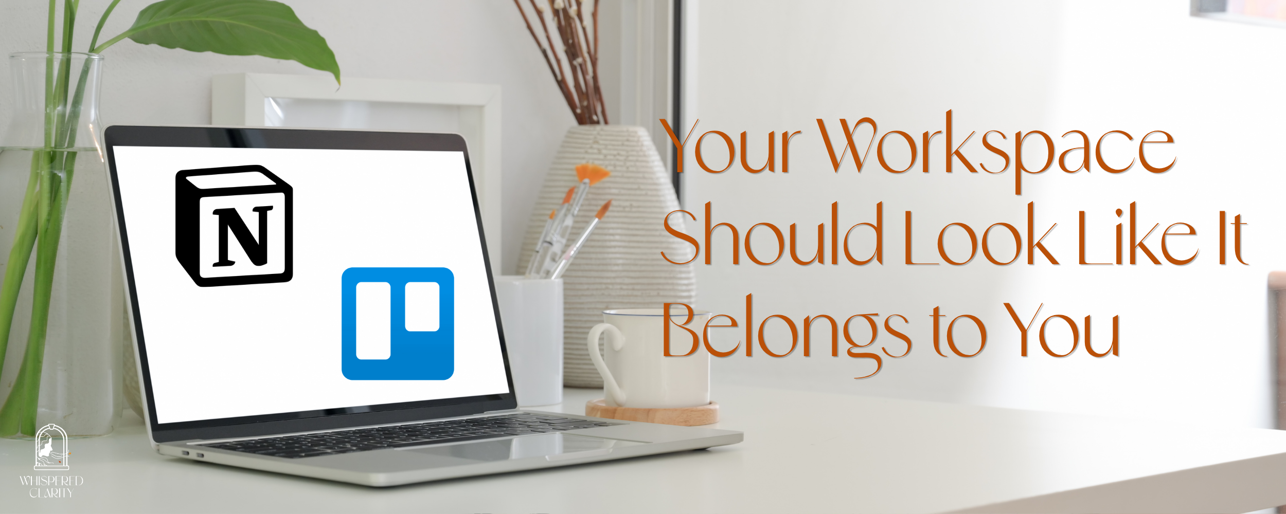
How Trello and Notion Can Become a Visual World — Not Just a To-Do List
Here is something no productivity guru ever tells you: how your workspace looks changes how you feel about using it.
When a creative entrepreneur opens a blank white Notion page or a default blue Trello board, there is nothing there to invite them in. Nothing that says this is mine. And for people whose whole identity is rooted in beauty, vision, and craft, that matters deeply.
Both Trello and Notion give you far more visual control than most people realize. Your workspace does not have to feel generic. It can feel like an extension of your creative world — layered, intentional, and unmistakably yours. Your systems are the background of your creative life. They should be worth looking at.
Why Visual Workspaces Matter for Creative Entrepreneurs
Research in environmental psychology consistently shows that our physical and digital environments affect our mood, motivation, and focus(1). For creative professionals especially, visual coherence in a workspace is not decoration, it is a signal to the brain that says: this is a space where my work happens.
When your project management system looks like it belongs to you; when the colors, textures, and images reflect your aesthetic world, you are more likely to show up to it consistently, use it fully, and maintain it over time.
That is not a nice-to-have. That is a systems design principle.
What Is Possible in Trello
Trello is board-first and visual by nature. Its kanban structure makes it one of the most naturally visual project management tools available and most people are only using a fraction of what it can do aesthetically.
Board backgrounds. The canvas behind your columns and cards can be anything — a rich photograph, a branded texture, a custom image from your own visual identity, or a color pulled straight from your palette. Trello has a built-in connection to Unsplash, meaning thousands of beautiful, licensable images are available without ever leaving the platform.
Card cover images. Individual cards can carry their own visual identity. A cover color, a texture, or a project-specific image applied consistently across your board. Card covers transform a plain list into something closer to a visual editorial spread.
Color as language. Color alone, used with intention, creates instant hierarchy. When each stage of your workflow carries its own hue, you can read the state of a project at a glance with no clicking required.
Board naming. Small, but meaningful. The name of your board is part of its identity. The Quest Board. Studio Flow. The Collection. When your tools carry names that feel native to your creative world, you interact with them differently.
What Is Possible in Notion
Notion is document-first, but with the right configuration, a Notion workspace can feel less like a spreadsheet and more like a curated gallery: a living mood board of your work and your world.
Page covers. Every Notion page can carry a full-width cover image at the top. A panoramic banner that sets the visual tone before a single word is read. Notion’s built-in gallery includes gradients and photography, or you can upload imagery from your own brand world.
Gallery view databases. This is where Notion’s visual potential opens most dramatically. Any database, a client roster, a project portfolio, a content library, can be switched to gallery view, transforming rows of data into a grid of visual tiles. Each card shows a preview image, creating something that feels designed, not just organized.
Icons and visual taxonomy. Every page in Notion can carry an icon, emoji or custom, and when applied consistently across a database, they create an immediate visual language. Categorizing at a glance.
The visual system as a whole. The real power in Notion is not any single feature it is the way these elements compound. A branded cover, a gallery view, a consistent icon set, and intentional naming work together to create a workspace that feels cohesive and considered from every angle.
A Visual System, Not Just Pretty Backgrounds
The difference between a beautiful workspace and a distracting one is whether the visual choices form a system.
One aesthetic direction - earthy, minimal, moody, bold - carried consistently across every board and page. A limited palette of two or three colors used with intention. The same visual style repeated across card covers, page headers, and icons. Language that feels native to your creative world.
Your Systems Are Part of Your Brand
For creative entrepreneurs, the tools you work inside every day are extensions of how you work and who you are. When your project management system reflects the same intentionality as your creative output (when it is clear, simple, and beautiful), showing up to it every day becomes a completely different experience.
That is not decoration.
That is operational artistry.
Ready to Work Inside Something Beautiful?
Knowing what is possible is the first step. Building it in a way that is cohesive, branded, and actually suited to how your creative mind works is a different conversation entirely.
That is exactly what I do.
The Whispered Clarity Operations Design™ process is built for creative entrepreneurs who want systems that feel as considered as everything else they put into the world. If you are ready for a workspace that works with you rather than against you, I would love to hear about your work.
Let’s talk →
Contact: Reach out to discuss building a system that visually reflect you and your business.
Subscribe: Join the newsletter for operational tips and insights.
Follow: Find us on Instagram for more on operational artistry for creative entrepreneurs.
1. Physical environments: McMains & Kastner (2011), Princeton — visual clutter competes for neural resources in the brain, reducing focus. https://pubmed.ncbi.nlm.nih.gov/21228167/. Digital environments: Mark, Gudith & Klocke (2008), UC Irvine — digital interruptions cost ~23 minutes of refocusing time. UCI faculty page above.